The New Bus Departure Displays Nobody Asked For
One of Hamburg's small everyday symbols is quietly disappearing, and the replacement is worse in almost every way.

Some things become the symbol of a city. Think of London, and the red bus, the black cab, or the red telephone box comes to mind. When I think of Hamburg, the first things I picture are the red bins with their cheeky slogans, the red StadtRAD bikes, the white-on-blue street signs, and the LED bus stop displays. They aren't world-famous the way London's icons are, but when I walk through the city and see them, I know I'm in Hamburg. Unfortunately, we're about to lose one of them.
There's something I've always loved about those dot-matrix displays. The way each letter is built from a grid of glowing dots, the warm amber glow against the dark panel, the way they stay crisp and legible whether it's pouring rain or bright sunshine. They feel honest and purposeful, designed to do one job and do it well. Standing at a stop and watching the next departure tick closer is one of those small, ordinary pleasures of city life that you only notice once it's gone. And it's about to go.
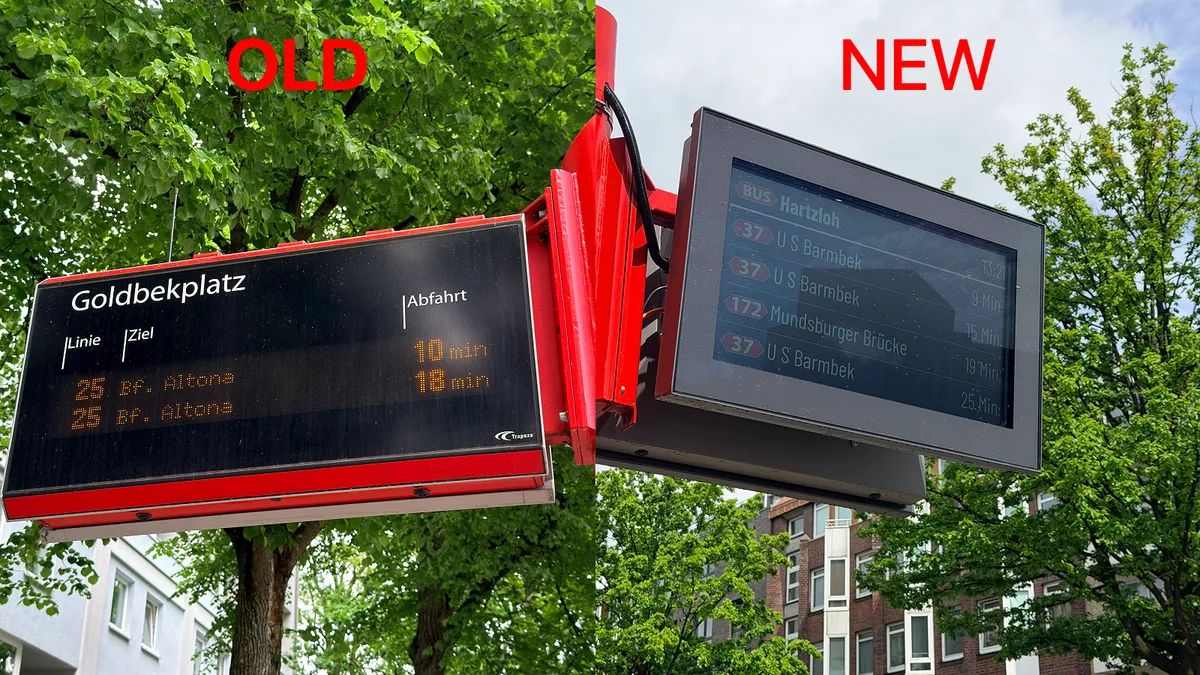
A few months ago I heard that the city was struggling to install its LED-matrix displays because they are no longer in production. The existing ones were originally designed by Trapeze and Siemens. Starting this year, they're being replaced with a new display from Funkwerk.
The first time I saw the new display, I was taken aback. There were so many things that made me wonder how it had been signed off. The most important quality of a departure board, for me, is readability, and this is where it falls down. As you can see in the photo above, glare from the sun makes it hard to read. And unlike the dot-matrix version, you can't read it from a distance; you really have to walk right up to it. If you get too close, you can't read it as well.
The second issue is energy consumption. The old dot-matrix LED displays used very little power, but the new one looks like an ordinary screen, so I'd assume its energy use is far higher. Given that these displays run constantly, I can't help wondering how much they'll add to the electricity bill, a bill the taxpayer ultimately covers.
Then there's the design. The old displays blended seamlessly into their surroundings. The new one doesn't, with its chunky grey frame and the blue background on the screen (presumably one of Hamburg's brand colours, since it shows up across the city's digital world, like the hamburg.de website).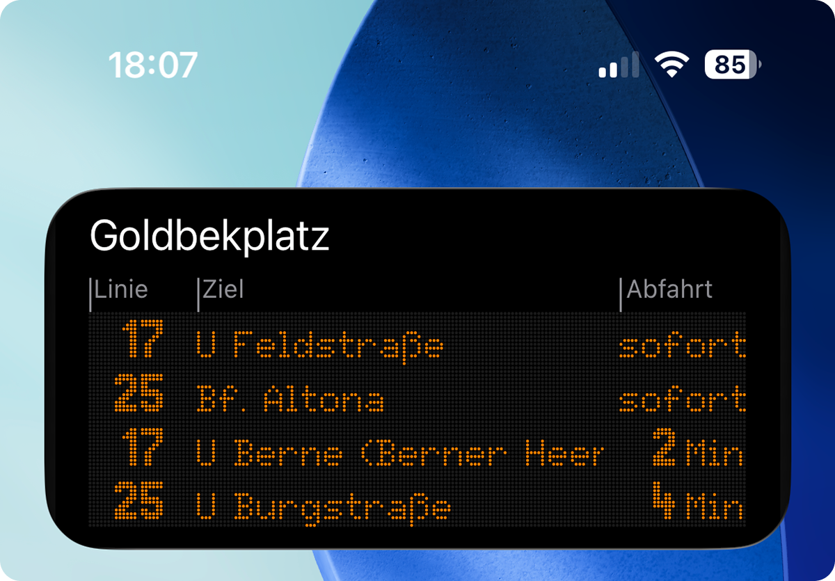
I loved the dot-matrix display so much that I spent hours recreating it in digital form and then added it to the Franzbrötchen app as a widget, so you can see the same look right on your iPhone's Home Screen. For this alone, I cycled around the city hunting for displays that showed different letters, so I could recreate every single character exactly as it appears on the real thing.
I've also read that the new display doesn't show scrolling text, which sometimes carried extra information for passengers. On the other hand, it does show the current time and uses colour to indicate the mode of transport: red for buses, yellow for the U3.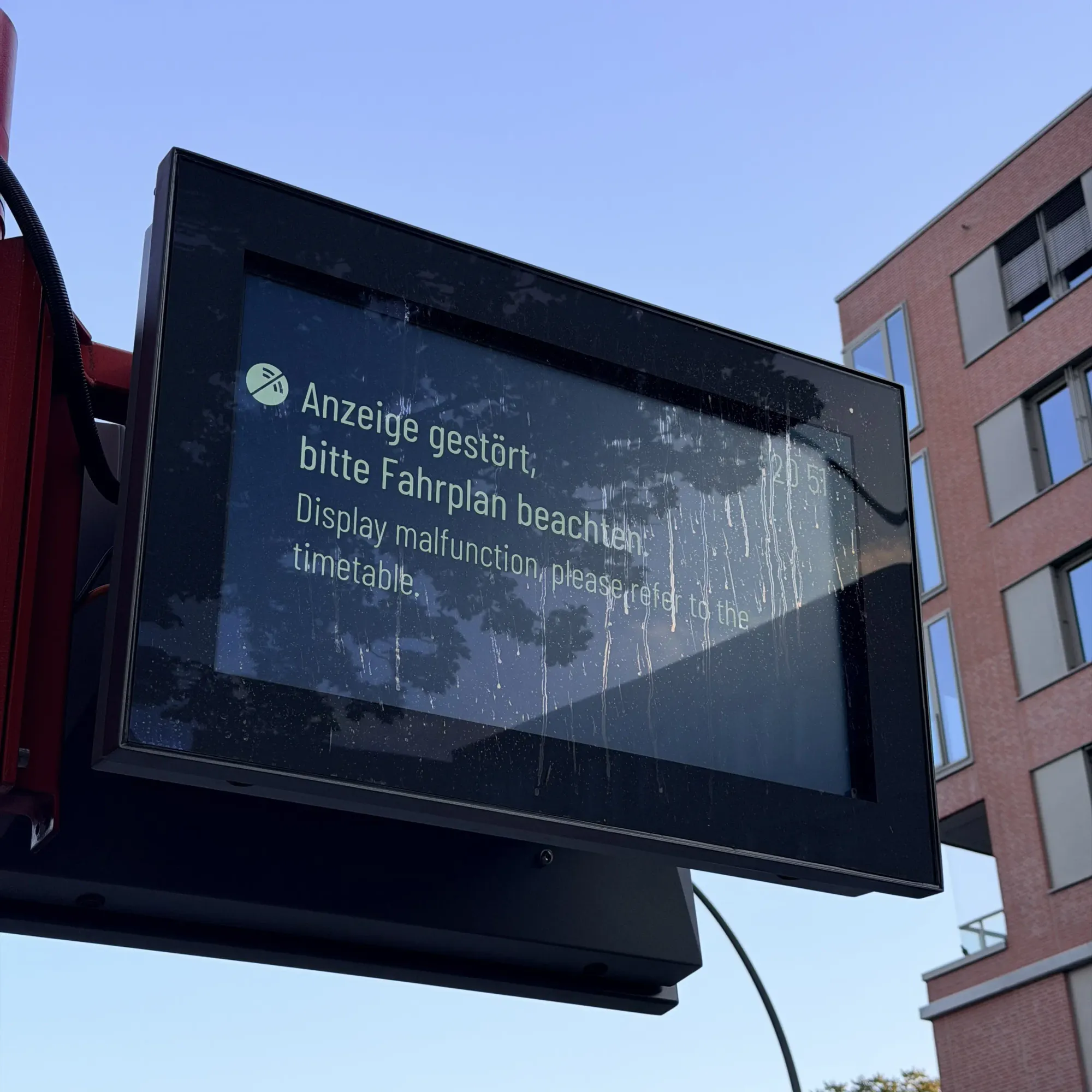
I'm not convinced HOCHBAHN needed to replace the old displays at all; they worked perfectly well. But what frustrates me is that the three things that matter most, accessibility, energy consumption, and design, seem to have been overlooked in the decision. Like so much else these days, it's getting worse, and it's sad to watch one of Hamburg's small symbols join the uglification we're seeing everywhere.
I still spot the old displays at a few stations, but I suspect that over time we'll lose them all. At least they'll live on forever in the Franzbrötchen app.